How To Improve Your Website Design? Explained With Practical Examples
Being a web design and web development company we constantly strive to give users a better web design with innovative thoughts. But innovative design doesn’t mean making your website completely different from others and leave the users completely blindfolded on how to interact with your site. The ultimate complexity is making the thing simple. Web design is not doing different things, it is all about doing things differently. Here are some of the tips to improve your website design.
Keep It Simple
As told before, simplicity is the ultimate complexity. When you make the design simple and interaction with your website easy, user tend to stay on your site longer than they used to be. When you make a thermal image of your website based on the user click, you might know the user interaction pattern on your site.
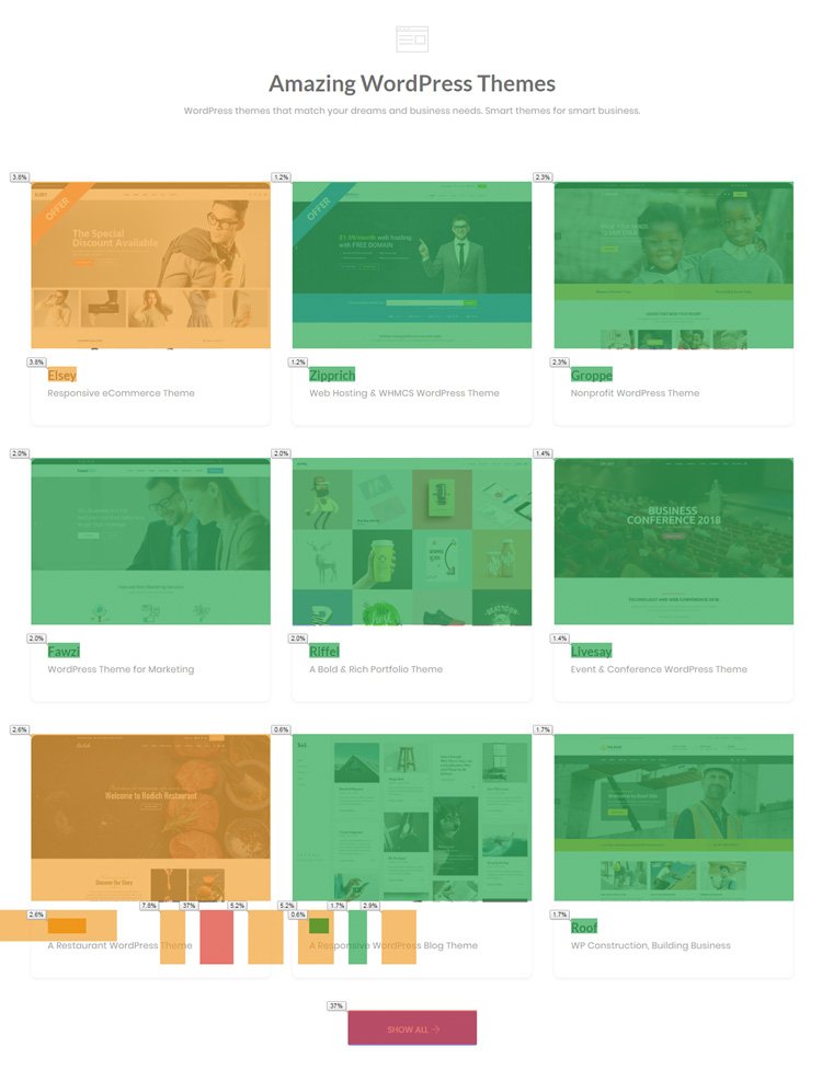
There are a number of heat map plugins to help you if you are using a WordPress site. Here I have used the general solution tool, Google Analytics addon for chrome. It shows the number of clicks on your site. From our homepage, you can infer that more clicks are on the menu and call to action buttons. The online users are the people with lowest tolerance and patience level. The user tends to skim your contents and look for the most relevant information. Make sure your web design is simple so that the user can easily navigate and get what they are looking for on your site.
White Space is The Trend
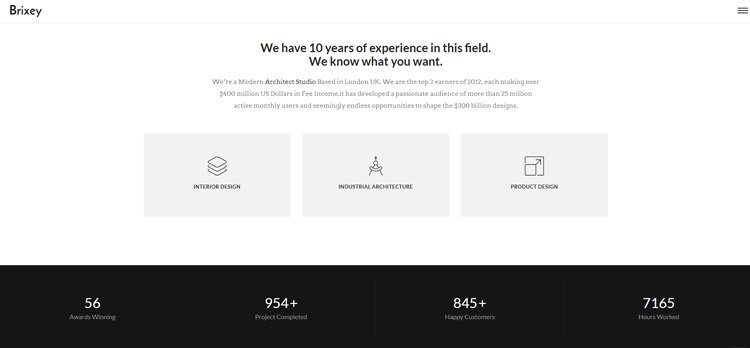
If you have a look at the recent WordPress themes, you might note that most of them follow lots of white space. Leaving lots of white space is not wasting the space of the screen, instead you are presenting only the most important info to the user. The white space helps the user to have a distraction free website experience. White space add richness to your site, it helps you to elegantly display your site content.
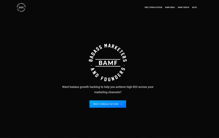
If you are using a dark-skinned theme, that is also a better choice of design. Black skinned themes gives you a royal and premium feel. Most of the luxury brands trends to follow the dark theme. For example, take a look at the Badass Marketers and Founders site, they follow the dark theme, but for content spots, they wisely went for white space for a better reading experience.
Maintain a Minimalistic Approach
Minimalism is the modern web design era. When we say minimalism it doesn’t mean the color and the design layout, it also points the visual effects on the template. Some of the templates really follow a clean design layout and trendy subtle color scheme, when they try to add too much animation effects, it spoils the entire design of the template.
The most important places where you need to add animation is the menu options, call to action buttons and the places where you think the users’ mouse pointer rests. For example, take a look at the Kinsta website, they are a website hosting company, it is one of the websites even we envy. In our WordPress design roundup post over a modern hosting website design idea I mentioned that I wish to see a hosting website like this, shortly Kinsta have shared their revamped site, am completely speechless.
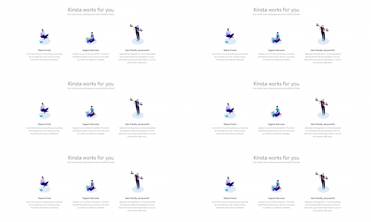
The animations are light so that the pages load faster and these effects give user an interactive feel. In most of our theme, you can see surprising web elements animations since we have to create themes for a mass audience. But we are creating such websites in our custom projects. If you are interested in creating such interactive website you can use our custom theme development service.
Don’t Just Say, Narrate Who You Are!
Storytelling is the most crucial part of any website. Many creative agencies and brands are trying more innovative ways to tell who they are and what they offer. Screaming Frog is one of such website which says about their history in an interactive scrollable interface. The attractive element in the web page is at the footer, a frog, and a fly element, instead of saying I have shared as a gif below, enjoy.
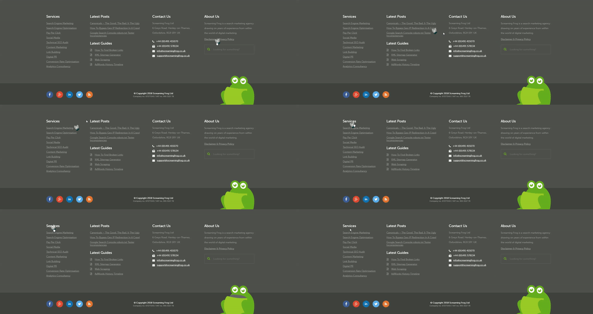
It is a small detailing that helps the user to understand how much you value your work. The most important segments you need to add to your homepage are;
- A strong intro that nails your brand in the visitor’s memory.
- A small gist of the services you offer.
- Unique features of your product.
- An interactive about us.
- Trust building testimonials.
- Experience boosting Case Studies/Success Stories.
- Resources to share knowledge.
Mobile Responsive Of course! But AMP?
Mobile responsive is almost a default option you get even on the free WordPress theme. In the premium theme, you get more customization option. I have made a list of plugins that help you to make an elegant mobile version of your site.
But if you are wondering whether you should use the AMP for your site, well the answer is with you. If most of your traffic is from mobile devices it is better to opt for the AMP, because Google has silently testing mobile first index and pushes the AMP pages in the mobile searches and in the Ok Google voice searches. It is wise to implement AMP. I have also made an exclusive article on how to make AMP pages, please take a look at it to get a better idea.
Contemporary or Classy Design
It totally depends on your target audience, you might have seen even though the modern websites have grown a lot some websites stick to their very old design. The reason for this, the brand is well known for their design. Here is a practical example, you might knowing GAP worldwide clothing and accessories retailer since 1969. In the year 2010, they decided to redesign their logo to match the modern audience.
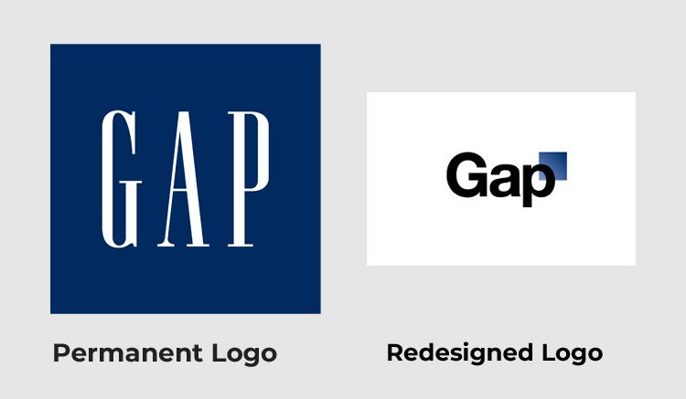
There were lots of backslash from its customer on the new logo and they replaced the new logo with the old one within in two days. So before designing or redesigning your website, consider who is your target audience. If you are into developing a new website please check our design guide for modern websites.
Never Settle
These are some of the basic things you have to consider when you decide to improve your website design. I believe in nothing is permanent and nothing is perfect, keep on experimenting small changes to your site whatever you think. Thousand may fail, hundred may succeed but if we don’t try the thousand we will never find the hundred success.
